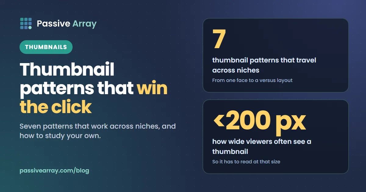
A good thumbnail does one job: make the right person stop scrolling. The examples that work best share a handful of patterns, and the patterns travel across niches better than any single design does.
Seven patterns that work
1. One face, one emotion. A close-up face showing a clear reaction, such as surprise, worry or delight, is the most used pattern on YouTube because people notice faces first. It works best when the emotion matches the video. A shocked face on a calm tutorial breaks trust.
2. Before and after. Two halves of the frame, the problem on one side and the result on the other. Strong for fitness, home, design, editing and any transformation.
3. The object, huge. The product, the dish or the tool filling most of the frame, often against a plain background. Common in reviews, cooking and tech.
4. Three words that add to the title. Short text that says what the title does not. If the title is "I tried every budget microphone", the text might say "only one worked". Repeating the title wastes the space.
5. A visual question. Something incomplete or unexpected that the viewer wants resolved: an arrow pointing at a detail, a red circle, a number that looks wrong. Use it honestly; the video must answer it.
6. Versus. Two things side by side with a clear divider. Comparison videos are searched heavily, and the layout tells viewers instantly what they will get.
7. A consistent house style. Big channels often keep the same colours, font and layout on every video, so regular viewers recognise them in a crowded feed. Once a channel has an audience, recognition becomes its own click.
What they have in common
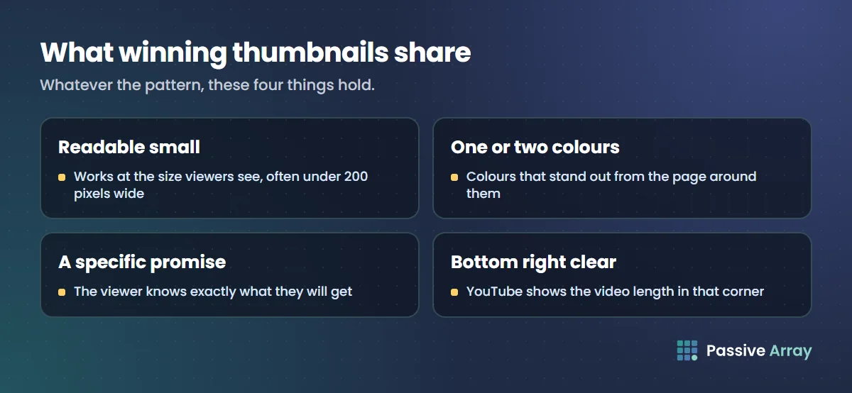
- They read at the size viewers see them, often under 200 pixels wide.
- They use one or two colours that stand out from the page around them.
- They promise something specific.
- They keep the bottom-right corner clear, where YouTube shows the video length.
The thumbnail size guide covers the technical side: 1280 x 720, 16:9 and under 2 MB.
How to study examples in your niche
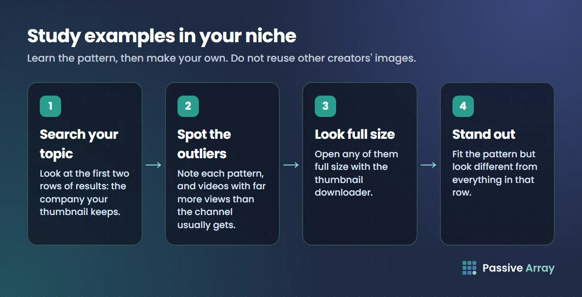
- Search your video's topic on YouTube and look at the first two rows of results. That is the company your thumbnail will keep.
- Note which pattern each uses, and which video has far more views than its channel normally gets. Those outliers are the thumbnails viewers chose.
- Use the thumbnail downloader to look at any of them full size.
- Design something that fits the pattern but looks different from all of them. Standing out in that row matters more than looking like the best one.
Thumbnails belong to the creators who made them. Study the pattern and make your own; do not reuse their images.
Test yours before you publish
Put your design through the thumbnail tester. It shows your image at the real feed sizes in light and dark mode, next to a title, and checks the dimensions and file size. If the thumbnail still says what it needs to at the smallest size, it is ready. Pair it with a title from the title generator so the two work together rather than repeat each other.
By Nasir Uddin, founder of Passive Array. Rules and figures checked Oct 29, 2026.